- Chloe Pritchard

- Feb 12, 2021
- 4 min read
Updated: Feb 13, 2021

-------------------------------------------------------------------------------------------------------------
{Analysing my film poster}:
{My Power Point}:
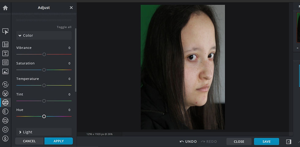
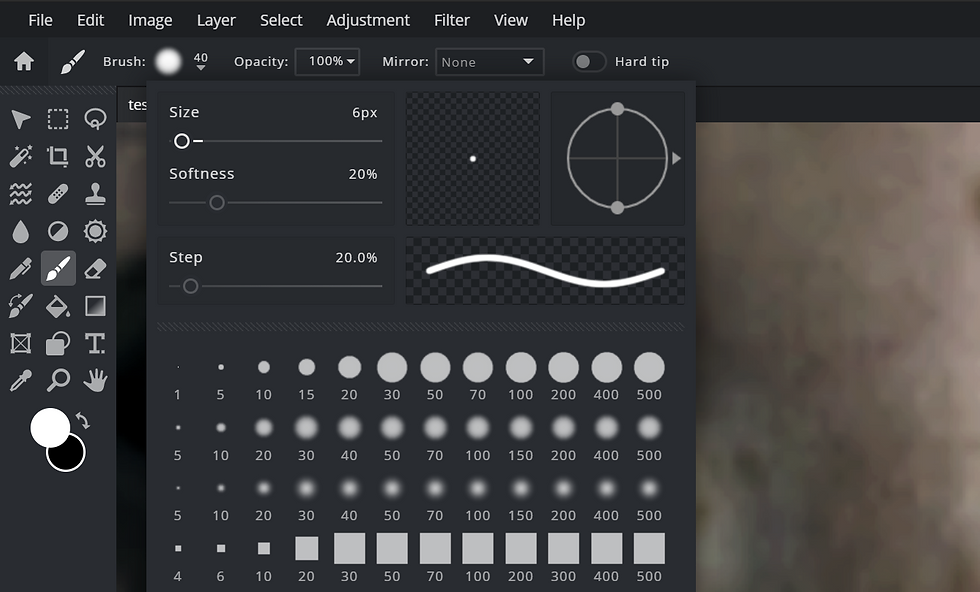
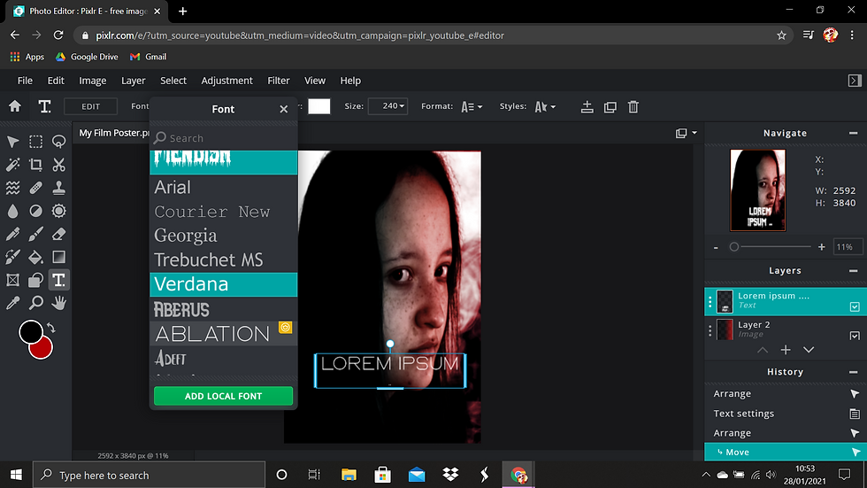
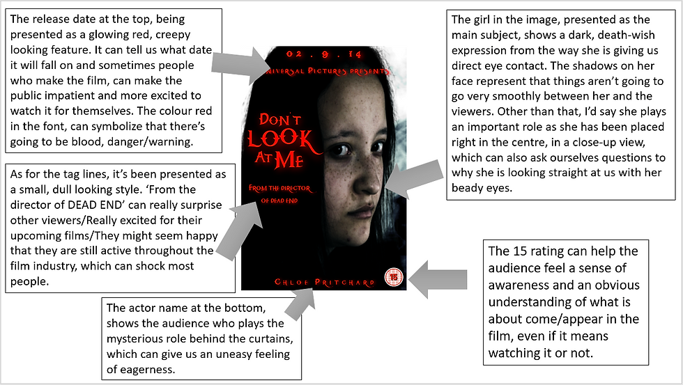
When I was editing my film poster in Pixlr E, I was really happy with what I've developed with the dual lighting, (especially creating them in different angles such as cross hatches, sideways, ups/downs etc), quick selecting, learning how to add layers, import fonts for text, using the curves/exposure levels, add dramatic filters, add shadow to give it a moody/scary and suspicious look, being able to feel confident with dodge and burn to lightly smudge dark areas to make the image more high contrast and look even more mysterious-like. There are some some tools that I still need to feel confident with, like importing types of brushes, but other than that, I was able to learn something. I'm extremely grateful and shocked with the talents I have developed throughout this unit. I was able to get used to the editing software's that were extremely new to me, even though I re-encountered some site errors along the way, I'm thankful that I was able to still try something new. Now I'll be able to edit/create something I've never had in mind/creating an idea. From the feedback I have received in class, I assumed that I got a lot of strengths because I included the main flavours that would be on a thriller themed film poster. I only got 2 weaknesses, which was only for typography, which is the release date and to use a different thriller-styled font for the title and credits. As you can see on the poster, we can take a look at the release date to start off. It's sort of difficult to focus/make out due to the red glow, caused by the strong sense of the blurred radius in the font and style, which makes it even more hard to visualize. Unfortunately, I wasn't able to make that steady foundation, since throughout editing, I thought that after you completely finished, that would be it. So to summarize my problem clearly, when I was finished with my film poster, I uploaded it to my blog and removed it off Pixlr E, because I thought that we didn't have to do anything after that. So sadly, I wasn't able to improve my weaknesses that I was given. However, what I'm stating now, is what I was told to do instead of improving my weaknesses, in other words, what I should have done to improve this.
(You can tell I was internal screaming when I kept crashing with this error):

-------------------------------------------------------------------------------------------------------------
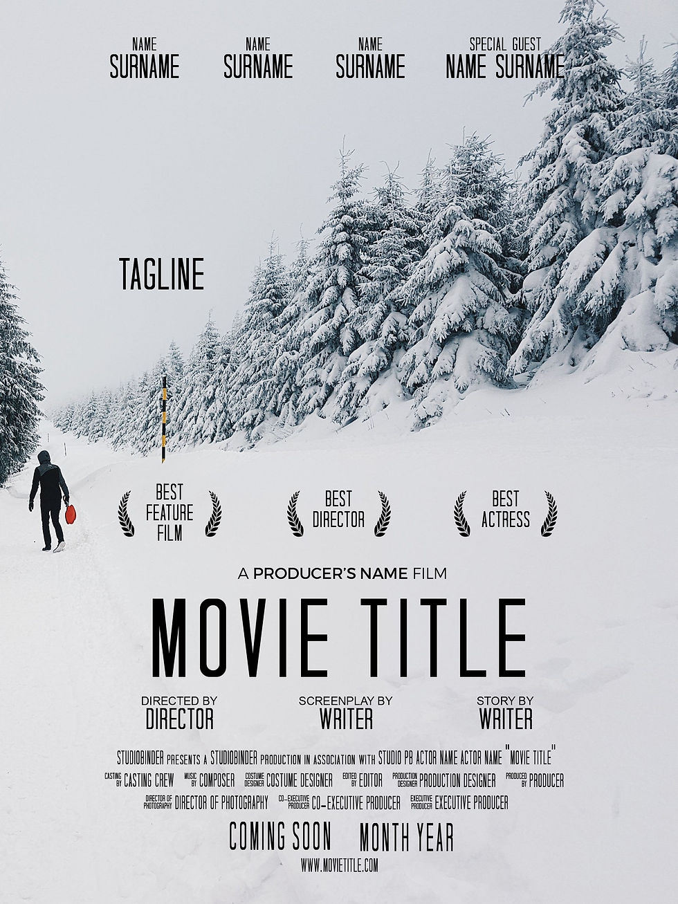
In my film poster, I took some inspiration from the film 'shutter island'.
{Here is the poster}:

As you can see from the shutter island film poster, I've managed to get the dark, bluish turquoise, storm filter for my main image and added a couple of highlights and shadows to it as well. Brings out the emotions of how a character is truly feeling and I wanted to do something similar to that. I has brought by the strong influence of the font titles as well, especially the tag lines. I loved the way the title 'shutter island' is bright and glows to make it seem attractive to the audience. So I did the same for my title, but instead, I wanted to use my own idea from it. So instead of making my title white, I chose the colour red instead and added a strong radius of red behind it as well to make it look more interesting. Of course, I didn't really include the same font style since I want to be able to produce my own creativity. So I went on Dafont.com and downloaded the font I wanted, and appropriate for a thriller film poster. In addition, I chose my colours to be black and white, because they show darkness and the way we feel, but more importantly, black and white can be used to be changed thematically, providing atmosphere, tone, and visually providing a strong and sharp contrast and a dreamlike view of their world.
Furthermore, I think my poster is really breath taking, because as you take a look at it from your perspective, you can really feel that sense of darkness crawling down your spine, which can make you feel that uneasiness feeling, when something isn't right or, you already know what's going to happen throughout that. Your eyes are suddenly fixed onto the girl's facial expression, can suddenly give you the impression of frightening hallucinations. (In other words, what scary images come into your head when you look at her from your perspective). Moreover, the typography can also make that steady foundation of a thriller film poster in my opinion. You can zoom in on that specific title and you actually get an impression of how she is deeply feeling about herself/Maybe showing her that she's angry. I mean, from the way the title is placed and presented, it can give us an obvious understanding of what might occur in the film.
-------------------------------------------------------------------------------------------------------------
WWW ~ As I kept being active within the software, I began looking at tutorials to help me along the way, so I took dual lighting for a test run, because I found it pretty inspiring. I've started to keep practicing dual lighting, remembered the following steps on how to do it, and before I knew, I suddenly became confident. I came to the point where I would just mess with the colour palettes to see which colour suited well for a thriller themed film poster. Furthermore, I got used to adding/merging/grouping layers, image files, adding/editing/importing text, adding moody filters like blues, reds, whites and I even started getting used to brightness, contrast, colour balance, hue and saturation, curves etc. I had a lot of fun with Pixlr E and hoping to do it once again in the future. Since Pixlr E was similar to Photoshop (software I found difficult) I think I'll be able to get used to it now, since Pixlr had the same layout and tools.
EBI ~ I could have tested Pixlr E out even further, instead of using the same tools twice. For instance, I could have learnt how to import brushes, blending images, add special effects etc. In the feedback and evaluation, in the future, I will remember to improve my weaknesses by saving the film poster on Pixlr before it starts crashing. I'll be forever grateful if I learned a couple of more techniques to make my work just like on everyday film posters, which is one of my #1 goals throughout this semester.