- Chloe Pritchard

- Dec 16, 2020
- 3 min read
Updated: Dec 17, 2020
Link to my magazine:
Link to my survey:
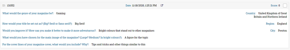
Audience feedback:


How have I met the target audience?
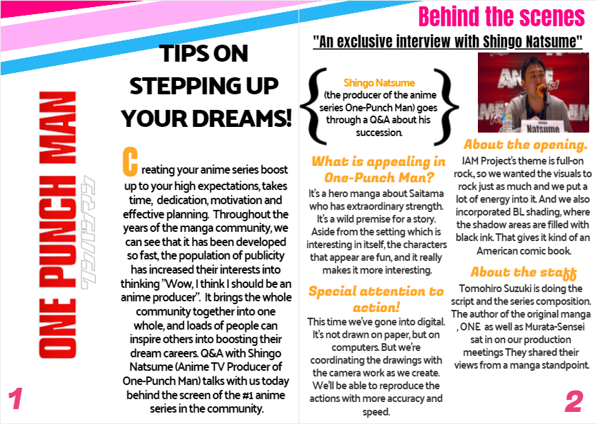
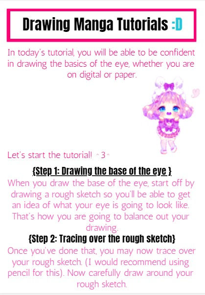
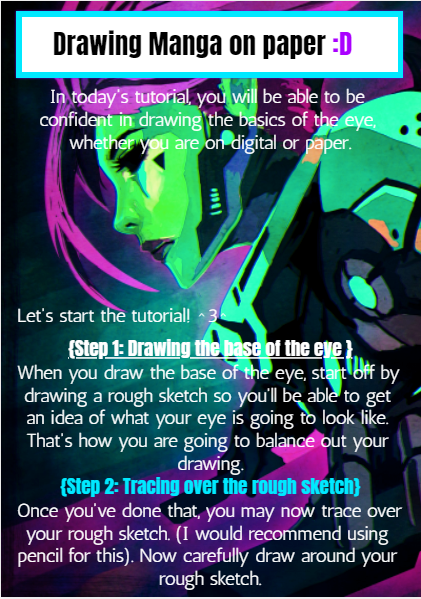
For the target audience, I have included most of the magazine elements and topics that a person with a certain age will love such as posters, activities and tutorials they would like trying out. I was able to research the ideas first, things that will inspire either a child or an adult to do in their everyday routine. I love how this all turned out as a result.
What I hope to achieve?
What I hoped to achieve, is to know the main elements of a magazine and to know how magazines are laid out. How I can inspire children to expand their talents and hobbies they will do in the future. If I keep this up, then more people will get inspiration.
Has it changed?/Reason?/ What was most successful?/Which part were you proud of?
I feel like it has changed a lot with comparing my original ideas with the new ones, When I was getting research off the internet, I've been getting A LOT of creative ideas just whizzing through my head because I'm picking up information as I go. As for the original ideas I had in mind, I wanted to expand them a little bit more if that makes sense. I honestly feel like improving my original ideas, was a great choice to make for this project because the more you expand your ideas, the audience can understand what my intentions are and what I'm trying to explicitly say to them, even though it's not in person.
The reason for these changes, is to make my magazine a lot greater with the feedback I had received, since it will give me more advice and plans about what I should do next time and for my production to rise up.
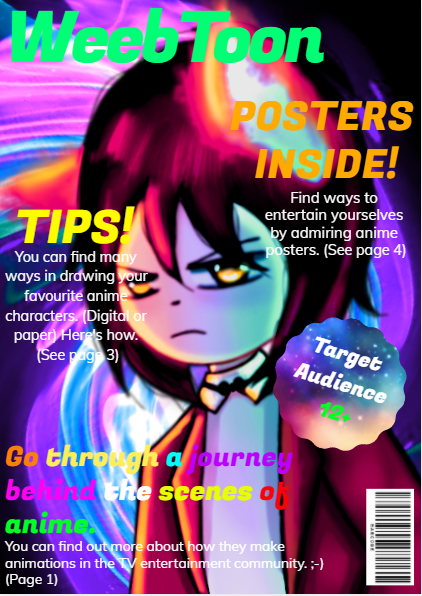
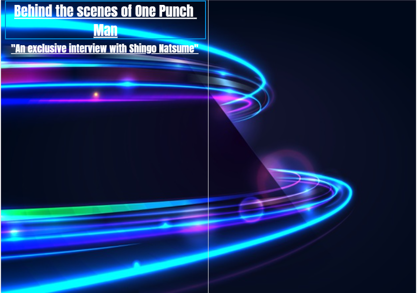
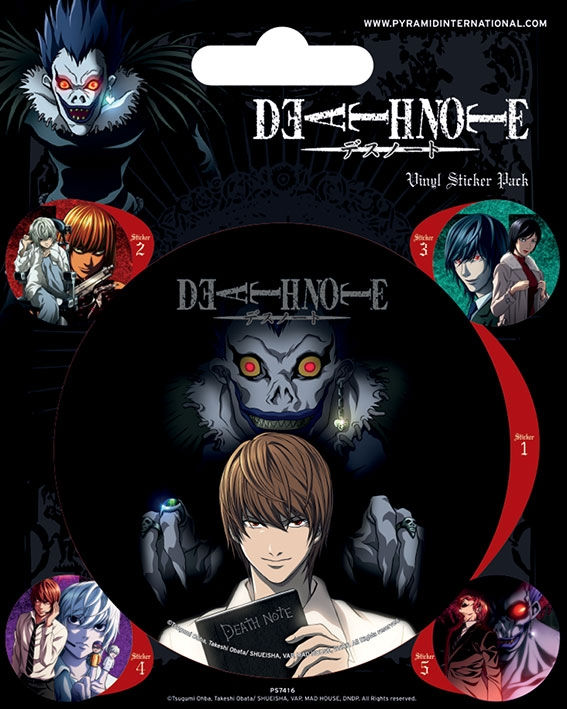
What I found most successful about my magazine, is the front cover, the main image I have used, which took (probably) an hour to do since it takes dedication to get the drawing just like you want it to turn out. I also like the style I have used such as the masthead at the top which is a sans serif font, since I want it to make it more original and not like the magazines we usually buy and admire in stores. I also like the fact that I used the following photo I took off the internet for the colour scheme, by using high saturations of colours such as: green, pink, cyan, purple, white and all that jazz. Not only did I use those colours I had in mind, I wanted to test out the filter scales and mess around with the hue scale to see which one was more preferable. It was an art platform I used to make the main image and to change the hue scale to how I wanted it. Furthermore, I went with the style I really like, which is more futuristic anime type, so I tried to use that genre, and adding it to my new ideas to create something that the audience will find interesting and admirable. Also not only the front cover I was really surprised as a result, it was everything in general.
Even though I had slow processing, getting the pages to how I want it, overall I'm really proud at how I managed to complete this before the due date and I hope to do something similar like this again. So that's going to be great.
What areas need further development and to change?/What would you do differently if you repeated the project in the future?
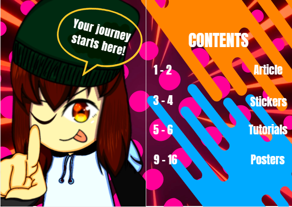
I think the area I could have improved on, is page 3 (stickers page). I didn't really put that much detail in it, since it's just stickers for the audience to cut out. I would've changed it to something better or get rid of that page completely and leaving the rest, since it's not really much about the production, it's how you came to that goal.
What would I do differently? I would probably go into more depth with the whole research thing BEFORE jotting things down, when I said I had slow processing into getting the magazine to how I want it. So hopefully that's what I would do differently in the next future media projects.