
{Blog 6} ~ Mock ups (My plan for my real magazine cover)
- Chloe Pritchard

- Nov 18, 2020
- 7 min read
Updated: Dec 16, 2020
My ideas:
Colour Scheme
With awesome assistance from the internet, I have been gathering a lot of inspiration.
First thing I'm going to plan out, is my colour scheme.
After taking a look through google images, I suddenly came across this photo.

As you can see in this photo, it has a compound of high saturations of colours.
- Pink
- Purple
- Cyan
- Green
I want to use this photo's colours to make my magazine cover presentable so the audience can see what my intentions are, also because I want to focus my style on the sci-fi/futuristic side, to make it stand out to other viewers.
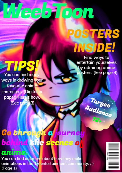
Main image
I have decided to draw my own main image for my magazine.
This is what I have decided to create:

Cover lines
For my cover lines, I went with something similar to the ones I used for my practice magazine cover. Here are some cover lines I came up with:
- Get a chance to WIN a FREE plushie.
- Tips on drawing in manga STYLE!
- COMICS INSIDE for you to READ!
- Let CREATIVITY be your #1 HOBBY!
Main cover line:
'Take a journey through the magazine and EXPLORE the wonders of ANIME.'
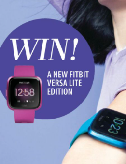
I've noticed that most magazines have plugs with their cover lines.
Here's an example:


Layout
Here is the layout I have chosen for my front cover of my magazine:

Target Audience
12+
Masthead
I'm going to pick the same title as my practice cover, 'WeebToon'.
Also, it's going to have a main feature, 'barcode' at the bottom left corner.
Creating front cover
Masthead/cover lines (font and colour):
For my title/cover lines, I'm going to be using a compound of colours, to see which one goes well with the background/matches with the main image. As I did with the practice magazine, I'm going to be adding a ray of glow onto the title as well, just to make it stand out more, and to make the reader's eyes fixed to the title. Furthermore, for the style of the font, I will be using sans serif fonts, since they have more varieties of styles. Also, the writing will be in a sans serif font as well, just to make it more original.
Page colour:
For the front cover page colour, I will be using the same colours, as to what I have picked out on google.


As long as these pigments match the main image and the font colours.
Article page
Layout:

For inside of the magazine, I have gathered information about LiSA, who is a music artist, and she sung for anime shows/What she does in her everyday life/Target audience.
Also, for my article page I'm going to be stealing this layout for the article.
What I'm going to be including:
- Interviews with her.
- Pictures of her and her band/concerts she's been involved in.
- Q&A's/Questions she answered.
- Quotes that she has mentioned in her interview.
- How many anime songs she's published so far.
- Including her CD's/Songs that she's been releasing.
Other topics:
- How to get better at manga drawing
- Comics inside
- Posters
- Stickers to cut out
My journey through making my magazine
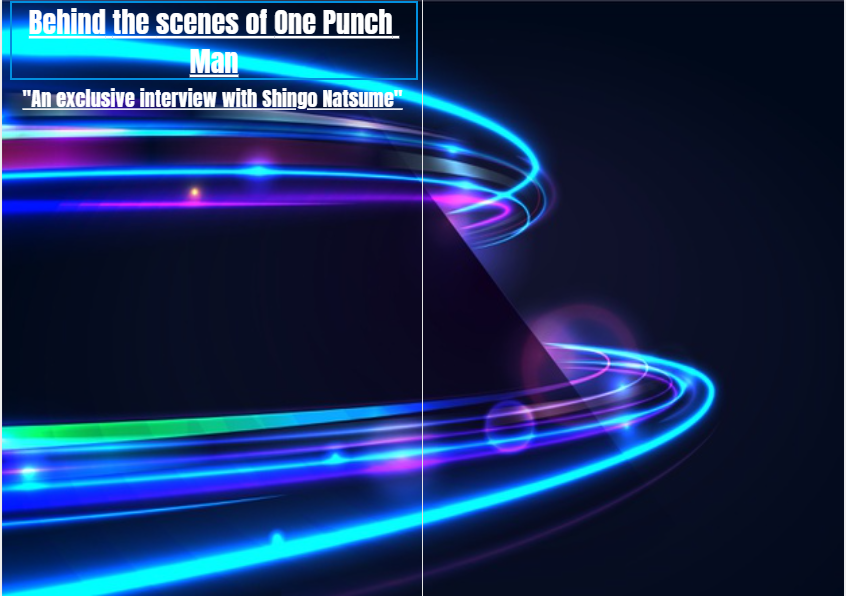
Front cover improvements:
Before I started making my front cover for my magazine, I was going to use this main image. However, I noticed that the colours didn't go with the ideas I have chosen. So I've changed it to this instead. I tested out filter scales such as hue/saturation/brightness/contrast/sepia/tint, to see which one suited better with the background, so I could make it more colourful to the audience to attract a lot of sales.


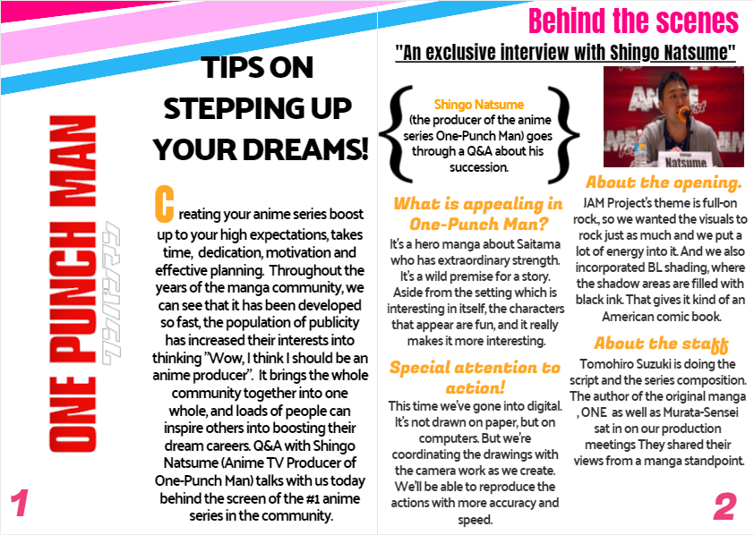
Improving results:


The last picture I did, is my final result for my front cover. I'm actually really proud of this because I made some changes to cover lines, which sounded a lot better. Also I decreased the main image brightness and hue saturation, so I could focus more on the reader, when they take a look at it.

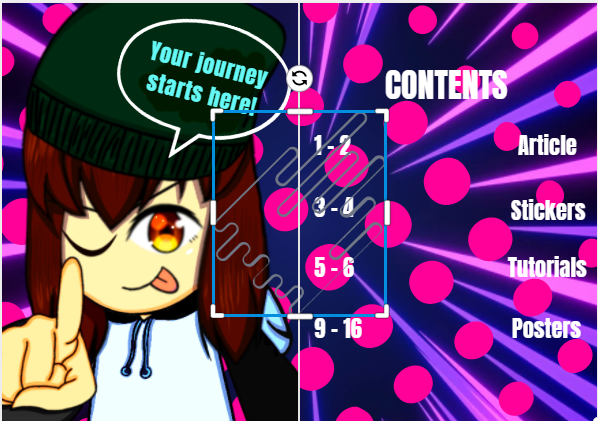
Contents page improvements:


Comparing the 2 (my first attempt for the contents page), I have changed the background to give the audience my style of background. Also, I've noticed that the text wasn't accurately lined up, so by re-typing it (separating the boxes and the guides included), I now find it a lot easier to line them up so the reader can find the page more clearly.
Taken a step up into the contents page, by adding my own art work as the main image for my contents cover, as the reader starts to take a look inside.
Improvements:
Like I did for the front cover, I used the same patterns for the background. For example:

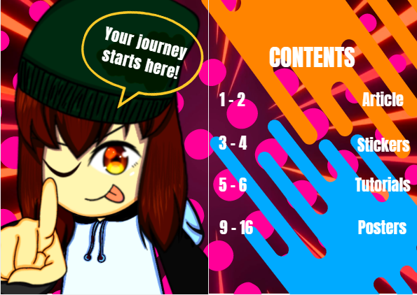
I have taken the liberty of changing the hue/saturation scales, so that it matches the pictures I have included in there as well.
Article page improvements:


As I have a taken a look at my article page, I have changed it's background to give the audience a better understanding to what the article is about.
I've made changes to the background, since the image I have used was stretched. As for the title of the article page, I increased it's size a little bit, so the reader can see it a lot more accurately.


For the background, last time I included an image which was completely stretched out. So it's layout didn't really go well with the magazine. So I have decided to choose whether to include an image or not. In conclusion, I added no image for the background and left it plain.
I loved the fact that I used the stickers to make the page stand out a bit more. I made the layout just like the practice layout I have stolen off google, just to get an idea of what I should do.
Final result:
I added the 'One-Punch Man' slogan to give the audience an idea of what the article is about, since I want my article to be a bit obvious.
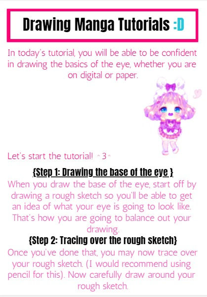
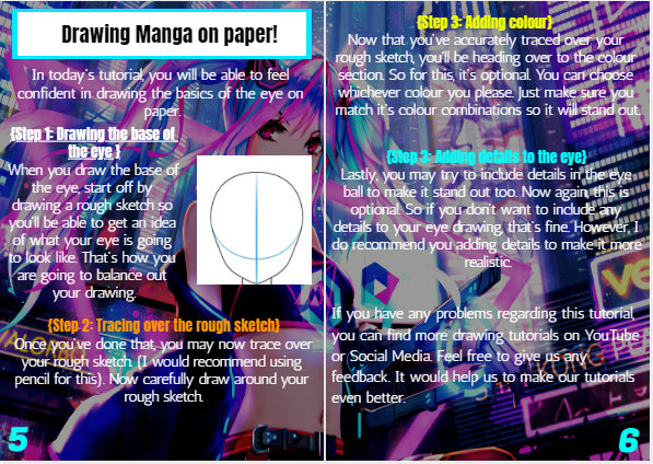
Tutorial page:
1) For my tutorial page , I have included a title at the very top (e.g. black, bold sans serif). Also along with the subtitles. Furthermore, I have also taken the liberty of changing the article colour (e.g. From blue to pink) and font (e.g. sans serif) I have used these elements to make the reader understand what the page is about, clearly. After going through a lot of research on magazine layouts, I have decided to make some changes to it, as you can see in the pictures shown.


Or
Throughout making changes to the page, I've been picking up more ideas on improving it.
As you can see in the image below, I definitely did some updates on the colour and font of the titles/blurb.
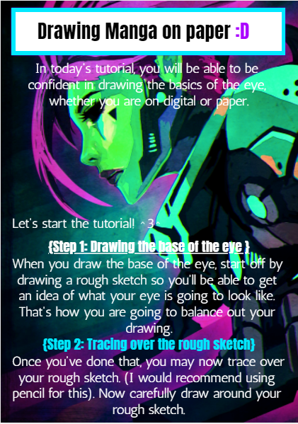
Now I began making some changes again to the tutorial page, since some of the pink backgrounds I have used off google were very pixelated and boring. Instead, I have made up my choice to choose a cyberpunk art background, since I want to make it more of the 'action, futuristic style'.
This is the image I have chosen:

As for the title and blurb font/colour:

I think I did well with my recent changes. This page background really brings the futuristic vibe to the audience. Also going through the colours of the titles and writing, I've noticed that I was unable to see them all clearly, due to the background being so high saturated. So I've made up my mind in keeping it the same.
My sudden changes:
Changing the background:

Moreover, I have made a change to the background, since I want the background to be a little less dark and a little less bright. So I needed to have the right amount of colours to have the exact balance. Other than that, I think I am pretty happy with this sudden change.
Final result:
Made some changes with this page. (e.g. page numbers, added pictures)
I feel like this is a lot better than the one I originally did. There's more space for the page numbers, the paragraphs have all been lined up properly, decreased the brightness scale for the background a bit darker so the reader can see what this page is about.
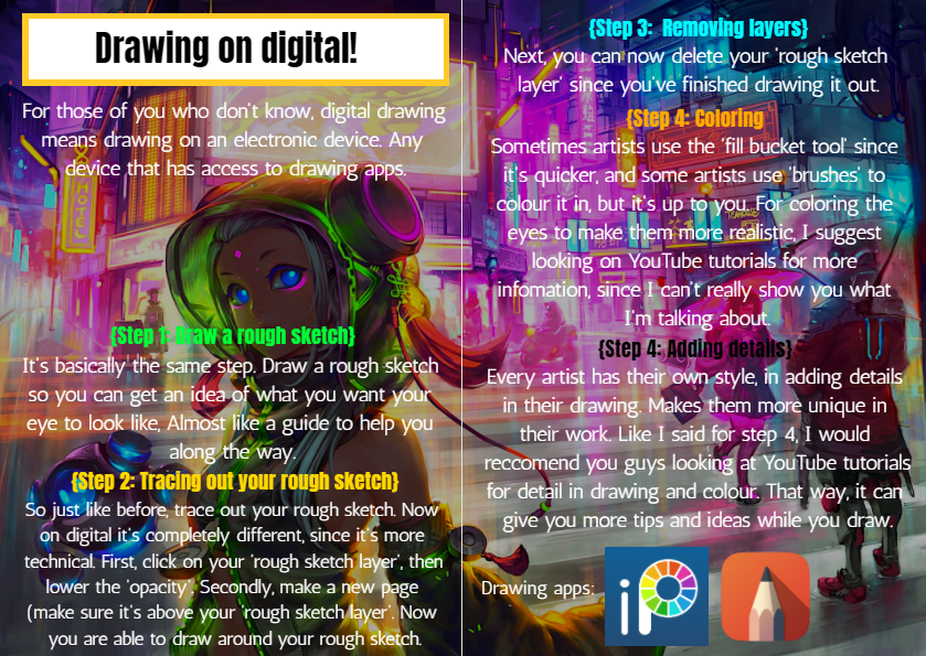
Next page on tutorials:
For my next page on tutorials, this time it's going to be about 'How to do drawings on digital'.
I want to give the audience a better understanding that there are other ways of drawing art, and that drawing on digital gives people more varieties of how to make their art even better, including:
- More brushes
- Filters
- Layers
- Stencils
For my background, I have chosen this image:

It really brings out the readers eyes, thinking that it may give them motivation into drawing something like this.
Finished result:


I've added social media links to the page, so the audience can see where they can get more tutorials from and how to improve their drawings.
Improvements:
Same for this page:

If you can compare the 2 finished results, you'll notice that the backgrounds have gone from bright, to dark, since I want to think more about the reader when he views it, and will be easier for them to ponder through the magazine.
Back Cover improvements:


I re-sized the price tag, since I don't want it to fill the side of the page.
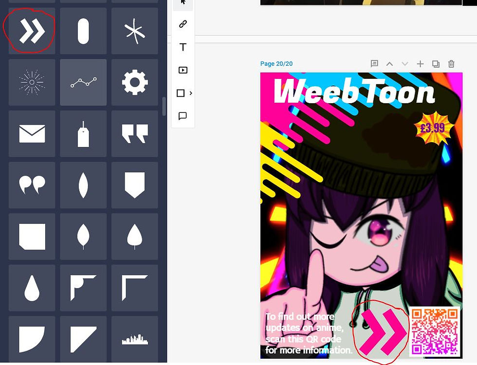
At first for my back cover, I was going to include the same main image I have used for my front, but I went with something different by adding my art work to the back instead. I have also included a price tag at the bottom just so the reader can see how much the magazine is worth. As for the title, I have changed it's colour from green to white, since I wanted to paste the same design idea, just like I did for my front cover. Lastly, I've added a QR code for people to scan, which leads to the vizmedia YouTube channel about anime series/updates on behind the scenes etc.
Since I wanted to focus more on the reader, for people who are using android phones, they won't be able to scan the QR since android doesn't have the app for it. So I also added a YouTube interaction so they'll be able to view it, whether they choose to scan the QR code or not.

Here's my final result for my back cover.

Final result for back cover:

Images I have used for my magazine:

This is the image I have used for the background of the magazine.

This is the image I have used for the magazine plugs for the front and the back.


Image I have included for my article page.

The image I have used for my contents page.

The main image from the article page. I was going to copy the layouts for articles, but I just went with what I had in mind.


Comments