- missluckyplays
- Oct 12, 2020
- 4 min read
Updated: Nov 18, 2020
Used IMdb for my research
Chosen film: San Andreas
Genre: Action/Adventure/Thriller
The Story: In the aftermath of a massive earthquake in California, a rescue-chopper pilot makes a dangerous journey with his ex-wife across the state in order to rescue his daughter. California is experiencing a statewide earthquake that goes on record as easily the biggest earthquake in history.
The Director: Brad Peyton
Stars: Dwayne Johnson, Carla Gugino, Alexandra Daddario
Slogan: No.
Released: It was released in 2015.
_________________________________________________________________________
What do their film posters/publicity look like?
1st film poster: The first film poster shows a lot of the central character because you can see the stars name 'Dwayne Johnson'. Also, that it's based in California, because you tend to get a lot of disasters there.
2nd film poster: The second film poster shows more action, as you can explicitly see that he's trying to get to the other side without falling deep down into the earth's core. You can also see people's cars falling down, buildings collapsing and if you can see the helicopter hovering over the central actor's head with a rope hanging down. You can see how dangerous it is to be in that character's position.
3rd film poster: The third film poster is exactly the same as the first one we've seen. It has the name of the central actor, where the film is taking place. Except tat it's in a different language.
4th film poster: The fourth film poster really stands out to me. You can see the mist/dust coming from the buildings that are dropping down. The tag line really stands out to me as well, 'Where will you be/Who will you be with'. It sometimes gives that heart warming feeling, telling us that a hero will come and save you from disaster or someone coming to search for you, as you can tell by the main character hanging on a rope from his helicopter. He's saving those through his courage.
5th film poster: The final film poster shows you the night to day style. It has the main character's name/location/bright lighting/titles are sans serif. The bottom of the earth's core and the world above. 2 different areas, showing you that they are completely different. Once you are at the bottom of the earth's core, it stops your life journey.
_________________________________________________________________________
Print screen 5 or 6 examples from the film from the internet as research and say why you have chosen these images to represent your film:


I have chosen these images because it shows how equivalent they are and how they all represent the genre of the film, so the audience can see what kind of film they are going to witness seeing. I also love this film poster's design because of how the message gives tension to me and the audience, almost as if they are telling us to watch out for the future of the world. Each one of the film posters I have picked out, share the same design and show us how the mood is structured out and what the film is based on.
The tag line really stands out as well by showing a sans serif font to make the audience think that it matches well with the colour of the film poster 'We always knew this day would come'. In my perspective, it shows how the tag line is telling us how serious this devastation of earthquakes are and can ruin people's lives and wealth because earthquakes destroys everything in it's path and you can't run away from it.
_________________________________________________________________________
Film promotion platform:

After doing some research on different types of film promotion, at first I was going to promote my film on bill boards, but I suddenly had a change of thought and made my choice to promote my film outside cinemas. I took some screenshots on other film posters outside cinemas too.
There isn't just one.


_________________________________________________________________________
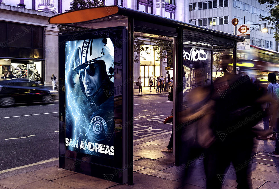
My film poster promotion

Feedback:
Works as a teaser poster as it is clearly about a disaster movie based in LA. I can recognise this through the use of the hero. You can tell he's a hero because of the badge on his sleeve and the use of dark colours. The only thing that could make it more realistic, that the lightning that's going through him, maybe blend it so it doesn't look like it's been painted on photoshop (blend) and maybe make the lightning blue to match the sky.
My response: I think that would be great change for my film poster. Making the lightening more realistic by blending it in and changing it's colour balance. Overall, I think I'm proud of this.
Improving my film poster:

Presenting my film poster:

_________________________________________________________________________
What went well?
I think my film poster turned out to be successful, since I wanted to make it as stormy and realistic as possible. I also loved the way I added lightening to the clouds, changed Dwayne Johnson's colour balance to match it with the sky, to make it look like he's flying in his helicopter, into an aggressive disaster. Moreover, I loved the idea of adding a sans serif font, that's filled with cracks on each letter. I wanted to give the audience an idea of what the film is about and I wanted to make it a bit obvious. At first, I was going to go with Dwayne Johnson flying in his helicopter, and then you can see out the window, buildings falling down. I realised I didn't want to make it the same as the original film poster, so I've decided to change the design, so it wouldn't look too similar. I did change my film poster to go onto a billboard to outside the cinema. I wanted to show the audience how I can use my head to create film posters without using someone else's, showing how I can keep my sense of style instead of using others. It can give the audience more varieties of films they would like to see.