- Chloe Pritchard

- Jan 29, 2021
- 1 min read
Updated: Feb 12, 2021

{My Power Point Document}:

Updated: Feb 12, 2021
{My Power Point Document}:
Updated: Dec 1, 2021
{Softwares I have used}:
{YouTube Tutorial that helped me along the way}:


I managed to drop my image file into the software. At first, I was going through some errors along the way, but I suddenly found options/easy ways to add them in.


I went through some predicaments/errors with the software itself while I was trying to resize my image to the exact ratio I wanted. As a result, it turned out pretty ok. For me as a beginner, I wasn't really expecting myself to go this far through editing. Although, being able to cut the background out with Photo-Pea is a skill that I mostly need work on.

I've now added a black, abstract, smoke background to the main image so I can set the mood and match it with my story line. So, you can see there's a black void merged with the white smoke which creates a very monochrome styled atmosphere.

Now you can see that I've sort of tipped the background upside down since I want everyone to see my whole entire head, what I look like, who am I, who I am as a person and with the black void merged with white smoke, I thought it would create more tension if I changed that. So from white to black, it's as if it represents 'good to bad'. See people don't know what's going to happen along the way, like on the outside of me, I may be good, but on the inside, I am a monster.
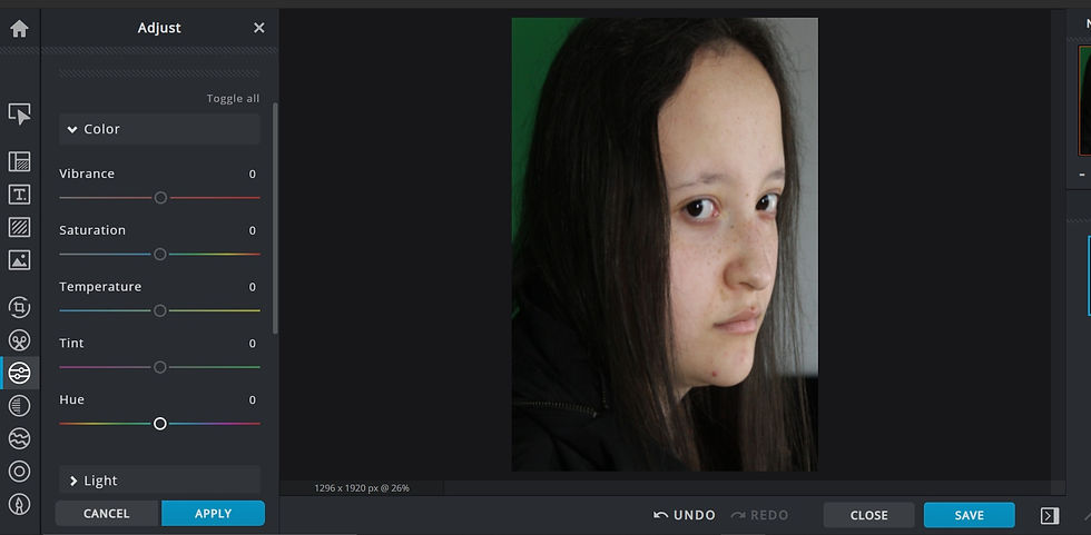
I also changed my image adjustment, so it's matches the same background filter. So you can see that it's more of a dark, blue-ish colour and the shadows makes it more realistic too.


Now you can see that I've added quite a bit of shadow to the face, so it just gives everyone a 'puzzled' expression on their faces. Actually, it gives people a chill down their spines because you can see the photograph of me just staring at them, with the sharpness in my eyes, and adding shadow and a bit of highlights to it, just makes them want to know more about this character in person.

I had an idea of what I want people to see me as. For that, I would need to transform my eyes into something frightening that would drag a lot of people's attention to, using the 'zoom in button' and then I will be able to edit the eyes a lot easier instead of doing it still zoomed out.
{Here is what I mean}:


(For zooming in or out of the picture/Viewing part/Focusing on which part you want to edit)
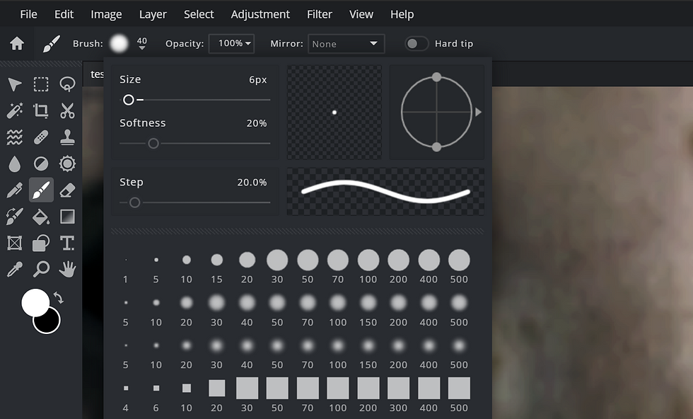

I used brushes for the pupils, so they can stand out a bit brighter. I also decided to make my brush smoother and a bit smaller, to make it more realistic.


I wanted to create a dual lighting effect, like another part of me is cursed, so I added another layer, went onto the 'gradient tool' Shortcut: G), I made sure that the type of gradient I was using is 'Linear'. I clicked on the 'gradient bar' and I wanted to make the dual lighting have more of a smooth transition in the middle so it doesn't appear as light to dark to light. The colours I wanted to choose was black to red, since the film poster is based on thriller.
For each of the colours I have chosen, I decreased the 'opacity' for each of them, because in the end, the poster would be too bright, probably would look eye-blinding and it would be way too much. I can use the arrows that were already a part of the gradient tool to know where I want the colours to be placed.


So after I sorted out the gradient for the dual lighting, my cursor should be in a shape of a cross, and I clicked on the screen one time while holding shift down, and would mark where the lighting will be positioned. Also I got rid of the harsh, red lighting by decreasing the opacity level.
{Finished editing main image}:

Font Ideas:


{Process}:

Adding text to my film poster.
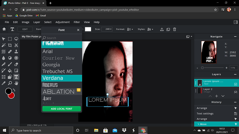
I added another layer for the text, since I don't want everything to clutter in one. By using the 'text' tool, I went to 'add local font'. In other words, it let's me import fonts that I have already downloaded, instead of using the ones that were already in there.

(The font I am using)


With the font I had already downloaded, I changed the colour scheme to red to represent the blood effect that's dripping down. I also attached a warm, red blur to the shadow as well, to make it more moody and freaky. I almost had the idea of adding an outline to it, but it didn't really turn out well, so I have made the decision to leave the title at that.

I also have taken the liberty of adding a PG logo, to make sure that the audience is aware of who should be watching this. I've even darkened some parts of the head as well, to show that my hair is creating shadow over that part or something covering it up. In addition, I included a bit of highlights to the layer.


{Improvements}:
(Studying layouts of film posters)


From the feedback I have received from my teacher, I have included a 15+ logo to represent the horror genre and who should be watching it. (Changed it from PG to 15 since we don't normally see PG rated thriller movies). Furthermore, it's also to make the audience aware that there's going to be some sensitive scenes which may occur along the way. I also added that dark shadow to my face to make it seem more realistic and making the audience (who are interested in horror films like these) feel that horror vibe.
In addition, I have also attached the typography for the film poster (text) in a creepy, blood red, sans serif font to make the poster look even more interesting. Also, I added a faint, red shadow to the text, as if it were glowing to drag the audiences eyes, to make them aware of what the film is about.
For the weaknesses I got from the class, I needed to improve on my typography. The release date at the top needs to be changed since it wasn't clear enough to see.
Updated: Jul 1, 2022
For my film poster, I wanted to do a practice before doing the actual thing, just in case I might run out of ideas, for which elements are going to be included, how they going to be laid out, what fonts/style/colour scheme I'm going to attach.


