Journey // Artwork
- Chloe Pritchard

- Jun 7, 2021
- 5 min read
Updated: Jun 8, 2021
This is my journey through creating my art work. These pictures are from what I used for my front covers, back and inside pages. This will be going into my artwork gallery and I'll be linking this blog to it.

For this screenshot I have taken from the iPad, I started off with a rough sketch to help me trace around the drawing I want it to look like. Other artists use this method, so I thought, why not do the same thing. In other words, creating a rough sketch is like a plan to what you are about to produce. I love how it creates a steady foundation and it acts like a guide to help me.

After I drew the rough sketch, on ibis paint x, I created another layer by using the 'plus sign' beneath the picture preview. I did this so I can draw over the rough sketch so I won't have to rub out the lines to make it neater. Next, by clicking on the rough sketch layer, by using the opacity scale, I made it a big transparent, so I can see where I'm going. It makes drawings a lot easier to control.

Also, I've decided to put a red ring around the 2 eyes, because they seem a bit unfocused. So I drew a red ring around it, so I can mark where the eyes are and that I won't mistake it for a different part.

This is the rough sketch I did in ibis paint x. I will be putting a link for it in my art gallery.
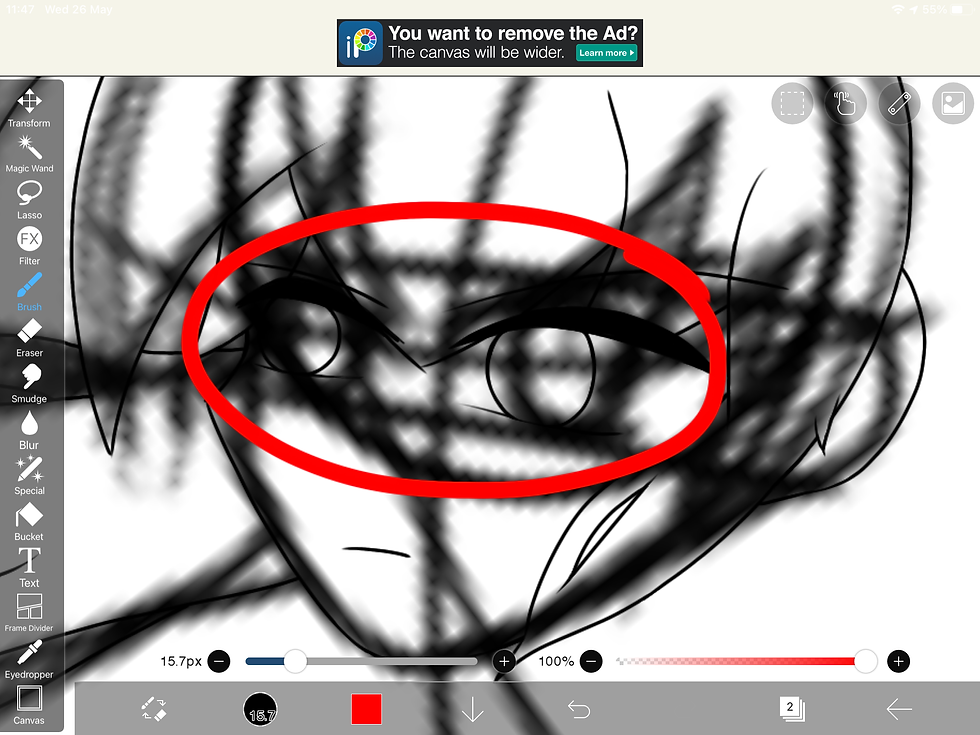
So with the other layer I have added on top of the rough sketch layer, I managed to draw over it (using the layer I have added). As you can see, there's another drawing that's overlaying the rough sketch, which shows I've already traced around it. I still marked the eyes with the red ring so I can see where the eyes are.

So I finished tracing over the rough sketch. I now made it invisible so it can't get in the way with what I'm going to be doing next. In this screenshot I have taken, I was fixing the eyes by leaving enough room for the 'white area'. It was pretty difficult to get the eyes in shape, but I got my head around it. I then started re-drawing the pupils because they seemed out of place between each other and they looked a bit uneven. Since I'm terrible at drawing circles, I used the stencil tools instead.

This is a screenshot of me using the circle stencil.

This screenshot is where I began to draw the eye details, such as: colour, shapes inside the eye, lens flares. There were still some difficulties with me getting the eye whites in there, but I managed to make it work out.

Next, I've decided to colour the hair in. As you can see, I'm using the colour wheel to get it to the exact shade of red I want it. I also used the 'fill bucket' tool so I can colour it in quicker and it makes drawings easier. Since the character's hair is going to be dark red for the top, then faded to black for the bottom, I had a solution to this.
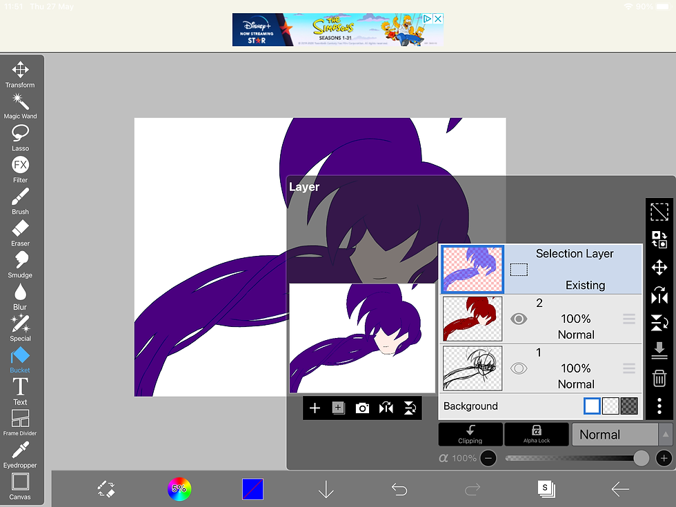
In this screenshot, it showing that I'm using the 'colour selection tool' for this to succeed. Once it's all highlighted, you should see dotted lines roaming around the part of the drawing you've selected and wanting to edit.
Like here:

Now what I do, is click on the 'duplicate icon' because I only want that part in the layer. I use this method because, for me, it's a lot neater and doesn't get too confusing.
Like this screenshot above: I even made the layer transparent for some reason.

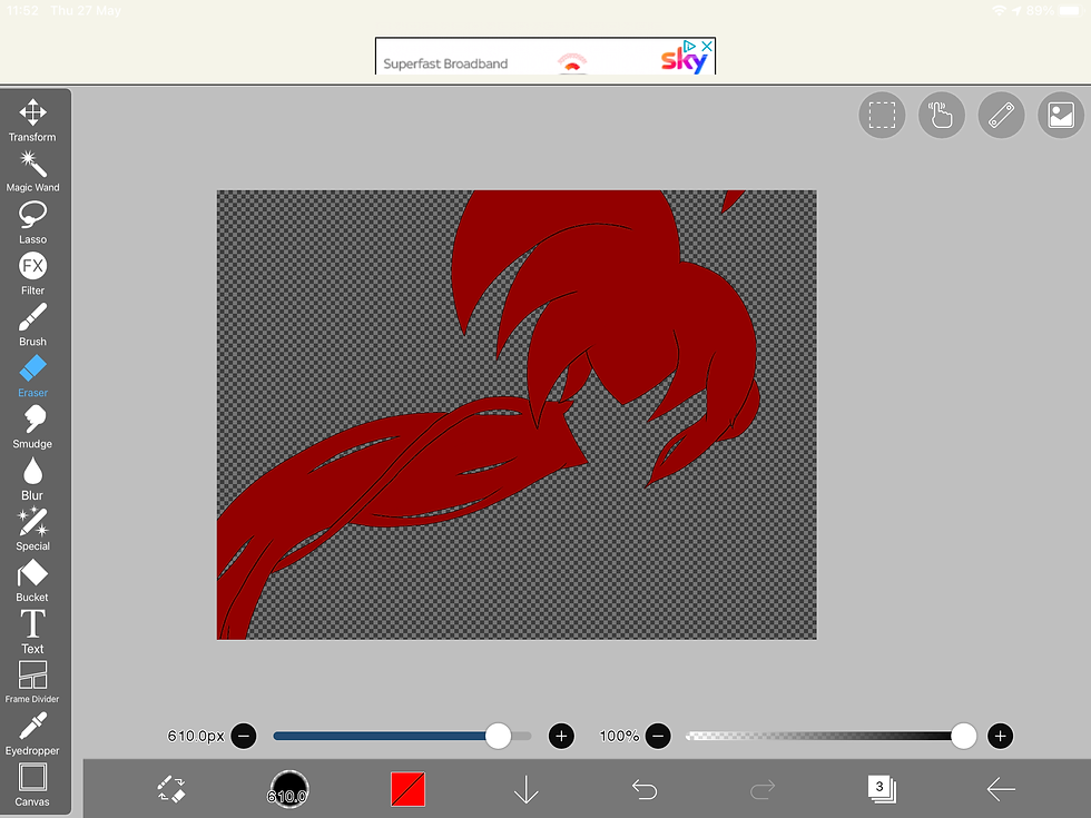
Now that I've done that step, I want this hair to be designed in anime style. I want to get the exact hair details that animators use for their characters. Every animator has their own style in colouring parts of their own drawings, so that's why sometimes all hair colouring styles are different. So this is the anime hair colouring style I'm talking about:


If you look closely in this pictures I got off google images, you can see that it's obvious that they use layers in order for all the details to come together. I can see that they coloured the hair in first using the fill bucket or brush. Then, they must have used the 'airbrush tool' to create the fade for the bottom. (fill bucket: blue, airbrush: darker shade of blue). Next, they used bright highlights to make the hair more interesting to look at, so they must have used a lighter shade of the colour they used to create a reflection from the light or sun. Furthermore, they used shadows for each part of the hair to make it look more realistic. So in other words, it's like backlighting, but it depends on where the sun is facing. For example, if the sun was shining on their face, but their whole face and hair is in a dark shadow, then it wouldn't make sense.
So that's technically my theory to how they have coloured hair in, so I'm going to be using the same method to see if it actually comes out as the same result. So let's just say.. I'm doing an experiment.

I've realized that I didn't like the eyes that much, so I redesigned them in my own style I'm working on. I've managed to get the eye whites in, which wasn't a bit difficult. I changed the eye pupils as well, from the tutorial I followed from YouTube. Here's the link to it:

Now that I have used the colour selection to edit the hair, I will be adding the shadows. By doing this, I created another layer, then used the 'clipping tool' then changed the layer type to 'multiply'. Changing the layer to 'multiply' multiplies the colors of the blending layer and the base layers, resulting in a darker color. This mode is useful for coloring shadows. This is me in the software showing a demonstration.

I even did the same for the skin as well. By including shadows underneath the hair, just to show that the hair is in the way.

So lastly, I decided to draw the body as well, by repeating the same method (e.g. multiply type layers, clipping, colour selection) I've decided to change some parts of the drawing, as you can see, I've added a light shade onto the hair, by using layer type 'add'. The Add mode adds the color information of the base layers and the blending layer. In digital terms, adding color increases the brightness to make it seem like there's a ray of light shining down. For people outside of the art community, for better understanding, there's This is my finished result. I'm really happy with how it's been turned out.


Comments