Flat plan
- Chloe Pritchard

- Apr 20, 2021
- 6 min read
Updated: Jun 9, 2021
This is my flat plan for when I start to produce my magazine.
So here's what I have in mind:

This is the flat plan I have laid out.
UPDATE!!
This document is my new and improved magazine flat plan.
{Front cover}:

This is the screenshot I have taken for my front cover. So what I am planning on doing, is doing practice pages, to see which one suits anime culture. So for the top of the front page, my masthead is going to be called 'Anime Legend'. I tried looking on the internet for ideas of mastheads to see which one comes up to mind. So according to the results I have received, I didn't really get much varieties. So I've decided to come up with 2 words, such as 'anime' so the audience an understand what the magazine category is, and think of a term to describe it's topic, so I chose 'legend'. I've also taken the liberty of leaving the front cover page white, because what I had in mind, is adding a screen tone effect, so it will be clear to see with it's white background.
I've then decided that I am going to change the masthead style as my own, because I want to make this magazine more anime-realistic as possible, so when the viewer takes a look at my magazine, it's like they are stepping into a world of manga. So this is how my masthead title is going to turn out:

(Screenshot of me in ibisPaintX recreating my title)
For my masthead re-design, I got the fonts off the app which was already built in, to see if they have any fonts I had in mind. These were the fonts I was going to choose:


These were the fonts I had in mind, so I decided to choose this font style:

I even used a website called Dafont: https://www.dafont.com/theme.php?cat=101
Since this website has more varieties and gives you font styles for different themes (horror, cartoon)

(Theme chosen: Cartoon)

I chose the theme cartoon, because normally anime is like a cartoon in some way, however there is a main difference is that anime is considered a Japanese style of cartoons. In other words, we see it as a Japanese style of motion-picture animation or as a style of animation developed in Japan. So not the kind of cartoons we see on Nickelodeon or Cartoon Network.
There were so many cartoon-themed styles, I found it difficult to choose just one, so I took a look at how each one of them is suitable to match my front cover. So I managed to choose the font I desired, which is this one:

This is the result it gave me:

I changed the background slightly, so the images don't look like they've been squashed together and that it doesn't take up that much room. Overall, I'm really happy with the font I have chosen and it's screen tone effect. I'll be adding a background instead of white, so the front cover doesn't look plain and boring.
Images I have chosen:


I've decided to choose one of these images for the background instead of my own, since I've had experiences with creating my own backgrounds for thumbnails/books and I want my magazine to be original, instead of copying front covers layouts.
Other than that, I find these images appear most common in manga films, as they stick to beauties of nature. In other words, they find artistic nature, made by hand, preferable to look at, just to see what it's like in a manga character's perspective.
I've decided to change the masthead's font, because when I added it to my magazine on flip snack, I was expecting the inside to be white and the outline to be black, but instead the inside of the font was transparent, so even if I were to change the outline to make it clearer, it wouldn't make a difference, it would be difficult to see when the viewer looks at it. So I'll be using 'Sketch 3D' from dafont.com. Hopefully it's not transparent on the inside.
Font files:
{Main images}:
For the central image, as I mentioned before, I want to make my magazine more original, so the viewer can realize that the creator has taken their own time to give us information about the category. They can realize that I'm not exaggerating. Before I drew my art, here's some inspirations I had in mind:


I've decided to choose these types of central images for my front cover, because I think that with only one person being the central image, it wouldn't look interesting to look at. So the more characters, the merrier.
App I'm using: https://ibispaint.com/?lang=en-US I've already begun with some rough sketches to get warmed up, so my fingers will feel confident in drawing the exact shape and width of the paint strokes.
Here is my result for what I did with the following images above:
I already had some ideas on how my central image is going to turn out, so that's why I didn't really do that much rough sketches. So I hope that I'll be able to gain inspirations from this little much. Overall, I'm satisfied with what I have at this pleasant moment.
Links to tutorials are here: https://www.youtube.com/watch?v=W89nOAhi8yE

This is my front cover I have so far. I've decided to leave the background cover white, so that the viewers can see my tag lines better. I went onto dafont.com and I used different fonts to see which one is suitable and appropriate for my magazine genre. So I went with the font 'Monster friend'. For the central image, I used a piece of artwork that I did not too long before. At first, I wanted to bring the picture a bit closer, so that other viewers can focus their attention on it more, but I decided to make it simple by expanding the picture size (not stretching it). I even used a shape (square) since I want this magazine to look more futurized/modern, I stretched the black shape that was already included in flip snack and rotated it slightly. I got inspiration from one of the magazine articles from Shonen Jump.

This is my updated front cover. I left the background colour as it is, because I think it suits the other magazine elements in there. Comparing the last front cover I did, I've now made it look more busy, by adding the banner, pugs and taglines. As you can see, I made the pugs slightly bigger and the font that's inside it. I made the '50% OFF' to attract more attention. There is still more elements to add, but overall, I'm happy with what I already have. Moreover, I've improved the masthead by including a shape for it's background. Like I said, I want this magazine to be a bit more modernized. I made the font slightly bigger so that everyone can see clearly. I even changed the font as well, because I realized that 'monster friend' didn't suit with the idea I had. So I didn't need help from dafont.com after all. The font I used was already in flip snack. I even changed the central image. I re-created the same picture using 'ibis paint x' on iPad, because the other picture's resolution wasn't too good, even if I tried to expand it more. So I managed to take my time and re-create it. I expanded the picture a bit closer, so that it seems more in the spotlight.
Monster friend font:
My journey through my updated front cover:

This is the screenshot I took, when I was re-creating my front cover. I included a banner from the 'shapes' menu, and used the colour palette icon to change the colour to black. I made it go to the very top because I'm going to be using the entire white space for the central image, pugs/taglines. Also, for the masthead I named it 'Summer Magazine' because according to my ideas, I said I'll be using bright colours and since the summer season is bright, I noted that down as a representation. The font I have used, following the pink arrow I put down, I used 'Fugaz One'. I didn't get this off dafont.com, it was already built in the platform. From the way it looks, the font matches with the black shape behind it, especially when I coloured the starting letters in 'red'.
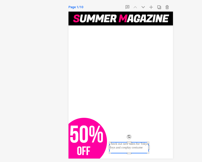
Furthermore, I attached a pug, as you can see on the left-hand corner, where it's been noted down as '50% OFF'. I thought it would be a good idea to put it in the corner and make it a bit bigger and it will be easier for the viewers to realize it's there. Also, as you can tell from the text box, I was noting down the taglines I'm going to include on there as well.
Here's the screenshot I snipped:


Sakurata Font:

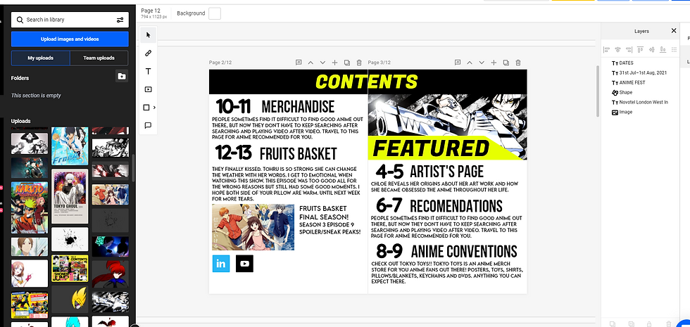
{Contents page}:


{Colour used for shapes}:

{Type of text that I chose}

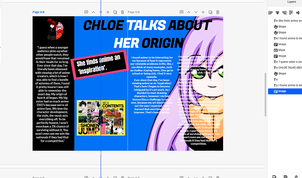
{Article Page}:
For my article page, I'll be writing about what I have experienced with anime. So my article will be on a double page, since there's going to be a lot of writing involved and images to illustrate it. So here's how I'm going to set it out.
This is the screenshot I took for my article.


{Recommendations Page}:


Comments