Technical Production Research
- Chloe Pritchard

- Mar 23, 2021
- 6 min read
Updated: Apr 14, 2021
{Designing Magazine Covers}:
These videos is like a guide towards learning about magazines, graphical techniques, drawing developments, learning it's layout, how they are designed, softwares they use, drawing techniques I can do and achieving to the best result as possible.
{YouTube links}: https://www.youtube.com/watch?v=1qzsqYiWSLw
{Masthead}:
Firstly, he mentions the important elements of a magazine, which is the masthead. In other words, a title for the magazine's main page. (Front)

He then gives an example of what he means by the masthead as you can tell by the red box surrounding the image, since we see loads of tag lines, subtitles on front covers of magazines, it's hard to guess which one is the main title. So it's very helpful.
For every magazine we see in shops, or maybe there are times when you buy a magazine in online stores, with every magazine you buy (with the same masthead), you notice that the colour has changed from their previous creations. It doesn't always have to be in the exact same result. Company mastheads can change their style and position to help and match the main images, colour scheme to help and attract more admirers. It's purpose is to not overuse the same schemes and style, otherwise audiences might find the magazine boring and less adventurous. However, their masthead name remains the same.
Also, sometimes the masthead can take over the page by it's size. If it's in a smaller size, they are usually on the top left corner. (We can take these magazine covers for example):


|INTERESTING FACT|:
If the masthead doesn't contain as much characters, they are usually on the top left corner.
If the masthead contains more than 5 characters, they usually take up the exact same width of the page.


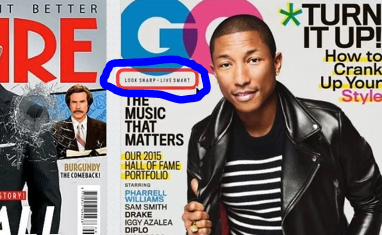
{Taglines}:
Some people like to call it straplines, magazine decks or sell lines, but whichever works best.

Taglines always appear on the magazine's front cover. Taglines can appear to be small/big, making the magazine stand out, so the audience will be able to come across it, which can represent it's refinement (In other words, magazine designers can develop their improvements) to make their work more admirable and sophisticated to it's target audience.
However, they only make small changes to help give them a little bit of an idea on increasing their developments as they go along. This could be, for instance (e. g - changing the text position slightly, colour schemes etc.) Furthermore, on topic, taglines give the viewer an idea of what the magazine is going to be about. That's it's purpose.

Here are more examples for taglines:


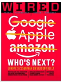
{Skyline/Banner/Strip}:
Skylines are usually positioned at the top of the cover, and usually take up the whole width of the page. They are sort of similar to taglines, but skylines refer to names of articles, names that are relevant to specific parts of the magazine. So we can take this as an example of skylines.

The skyline has been presented as a short list, it's position of how it promotes the different types of activities and events inside the magazine, which makes it seem pretty obvious obvious and the genre of the magazine it's covering. Also, it works as a tagline at the same time, as we can see that there's usually a date line, which is close to the masthead. There is also a date to when the work was published. You notice that there's a website/URL link for the site of the magazine. Again, it's sometimes positioned near its masthead and close to the barcode as well.
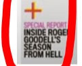
{Pug or Puff}:

We can take this picture I screenshotted as an example. This pug indicates that's a free magazine. Pugs can appear in corners or attached to the sides of the cover. When pugs are created, it has to stand out the target audience so they can see it's background behind the magazine cover. So it has to stand out using bright saturations, high contrasts, along with a hot, bold colour. Pugs are also there to promote exciting news or promotions. So I can say that the purpose for pugs on magazines, is for people's eyes to catch it, pick it up and read it.
Here's another example of a magazine pug/puff:

So what I described, they sometimes like to refer to puffs instead of pugs. There are other words used for this, such as: qualifiers or flashes. As you can see from a close-up view, we know that the style of the puff is commonly overused (stickers), since it's almost as if you're about to place the sticker down due to its shadow fade/outline behind it. Puffs can come in all different shapes and sizes, for instance: stars, circles, big or small. Normally with puffs, they would come in different styles, lengths and widths. If you were to look for cheaper publications, the probability would be 100%, and you would commonly find magazine covers with so much elements added. Here's an example:

So in the end, it would just nearly cover the entire front page, depending on how much puffs you add to attract viewers. It's a great way to increase publicity, but sometimes the more elements you add, the more publicity will find it too encouraging. (In any case, forcing them to read). So that is why magazine designers are highly aware of how they create their work/elements. They don't want their magazines to sound more obvious or boring. With that aside, it also makes the front page more neater, more sophisticating, professional and easy for the audience to read. Moreover, puffs don't always have to have outlines around them or don't have to have it separated in a magazine background. It can appear as big, bold text, maybe a small symbol to significantly apply what the meaning is.
Like this image I screenshotted for instance:

{Main cover lines}:
Usually with main cover lines, it brings the connection from the main image.
So in this case, he mentions that all this here on the side is known as the main head line/splash.


There is another element, that includes model credit. Model credits are given to the person to is part of the magazine, so at the front cover, if someone for instance: celebrities, stars or anyone were to model for a magazine cover, the person who creates the magazine, would have to give them credit for their work. It can also make a big difference for the increase of publicity, because if it's a celebrity you're a fan of, they would have a strong temptation to pick it up. Overall, that's it's purpose for main cover lines.
{Main image}:
Main images usually take up most of the main cover. We can take this magazine cover for example:

He mentions 'Daniel Craig' actor of James Bond, as the main picture for the front cover, because he takes up the whole of the page. Sometimes with main images, we would normally see them facing the front of the camera, as a way to get your attention, it drags us into the magazine. On the other hand, there are medium shots of people like these:


These types of images are known as, secondary/thumbnail images. We can also see that they have a barcode on the right-hand side. It is required, whether the magazine is sold to a news agent or shop. However, it's not necessary if a magazine is sent to a subscriber or obviously for a digital magazine.
Some of them can come in close-up shots as well, like this:

They might have strong crops, which either case, they might use medium shot images which don't cover the entire page completely. Sometimes people choose to be more adventurous to designing magazines, to make them look more original. Like this:

He mentions that the main shot of the person, is jumping over the headline, which leaves more of a blank space between it's main cover lines.

That's usually the case, so things won't be overused, so that magazine designers can get that stable balance of the amount of magazine elements they attach. Other than that, it's sometimes the case, so things won't seem busy or out of focus, so that the main subject is noticed by the amounts of publicity or highlighted. In addition, the main subject is jumping over the top, which opens up that white, empty space. This front cover is really creative, it gets straight to the point, brings an obvious hint to the target audience, so that they understand what this magazine is about, even though they aren't looking inside the magazine pages.
Furthermore, the main image doesn't always have to be taken from a camera, doesn't have to be a real person/celebrity. If artists wish to be more advanced in the magazine industry, they would normally create their own main images. It could be drawings, producing actual artwork, illustrations or anything, and can also overlap the masthead, as long as it's recognizable to its target audience. Like this:

Sometimes main images can be more complex, which takes up the whole entire page or can be less complex, so it just ends up as typography.

{Frames}:

Frames are like borders. So if we can take this magazine for instance, it has a thick, yellow border around the main image. We can also take this magazine for example:

Just like photo frames on a wall or painting. It just helps the magazine cover stand out more.


Comments